Interface Overview
TrafficCAD opens to a single workspace that is the same on desktop and in the browser. This page is a tour of that workspace so the rest of the User Guide can refer to its parts by name.
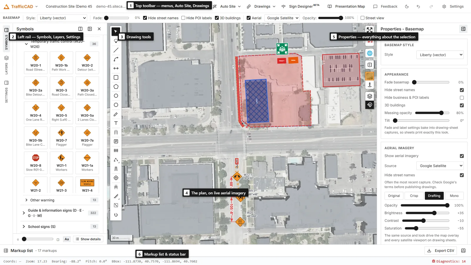
The workspace: (1) top toolbar, (2) tool chest — Symbols / Layers / Settings, (3) drawing toolbar, (4) the map, (5) Properties, (6) status bar.
The top toolbar
The toolbar across the top of the window groups every action into menus:
| Menu / button | What it does |
|---|---|
| TrafficCAD menu (far left) | The project hub — new and recent projects, your organization's cloud projects, the Dashboard, and your account. See Projects. |
| Project | Create, open, save, and print projects; live collaboration. See Projects and Sharing & Collaboration. |
| Undo / Redo | Two standalone buttons: one click undoes/redoes the most recent change, whichever document it was in (markups, layers, or drawing sheets). |
| View | Camera and view options — zoom, view history, reset orientation, split view, Show/Hide grid, and Basemap settings… (opens the Basemap panel). |
| Controls | Toggle map controls and tool panels (Search, Measure, Legend, Bookmark, the TrafficCAD logo, and more). See Map Controls & Tools. |
| Drawings | The sheet composer — see Drawings & Plan Sheets. |
| Sign Designer | The custom sign-panel designer — see Sign Designer. |
| Auto Site | Draw a box on the map and turn its streets, sidewalks, and site features into editable roads and layers; the arrow picks the feature types — see Roads & Vectorize. |
| Settings | Map preferences (including the default city), workspace layout, and appearance. See Settings & Preferences. |
| Help | The command palette, keyboard shortcuts, feedback, and the About dialog. |
| Feedback (right side) | Email a bug report, suggestion, or feature request — with screenshots and screen recordings attached. |
On the right side of the toolbar are the Feedback button, the light/dark theme toggle, and the editable project name.
Toolbar labels
On narrow windows the toolbar collapses to icon-only buttons. You can also force icon-only buttons from Settings → Layout.
A focused toolbar
The toolbar carries plan-authoring actions and nothing else. The things you reach for daily — Drawings, Sign Designer, Auto Site, the Presentation Map, the on-map aerial and street-view toggles, and the Basemap panel — are first-class buttons rather than entries buried in nested menus.
Command palette and keyboard shortcuts
Every menu and toolbar action is also reachable from the keyboard, so you don't have to hunt through nested menus.
- Command palette — press
Ctrl/Cmd+K(or Help → Command Palette) to open a searchable list of actions. Type to filter, move the highlight with the arrow keys, and pressEnterto run the highlighted command. - Keyboard shortcuts cheat sheet — press
?(or Help → Keyboard Shortcuts) to see the full list of global shortcuts.
The built-in global shortcuts are:
| Shortcut | Action |
|---|---|
Ctrl/Cmd + K |
Open the command palette |
? |
Show the keyboard shortcuts |
Ctrl/Cmd + N |
New project |
Ctrl/Cmd + O |
Open project from file |
Ctrl/Cmd + S |
Save project |
Ctrl/Cmd + Shift + S |
Save project as… |
Shortcuts are ignored while you are typing in a text field, so they never interfere with search boxes or attribute editing. On macOS the Cmd key is used; on Windows and Linux the Ctrl key is used.
The panels and the drawing toolbar
TrafficCAD works like Bluebeam's tool chest — a drawing toolbar always open on the map and a left sidebar you flip between Symbols, Layers, and Settings.
- Left sidebar — Symbols / Layers / Settings (a rail of three tabs on the far-left edge, always visible). Symbols is the MUTCD tool chest: search the sign and device library, pick variants, and open AI plan generation and sheet export. Layers is the layer stack (visibility, opacity, reorder, zoom, identify, per-layer actions — see Managing Layers). Settings holds the snap grid, measurement units, and project properties. One tab is expanded at a time; click another tab to switch, or click the expanded tab to collapse it — the rail itself never disappears.
- Drawing toolbar (always open, top-left of the map): the plan-authoring tools — Select, Place (a chosen symbol), Dimension, Work area, Road, Mask — plus grid toggle and undo/redo. It never collapses. The generic vector-sketch (geo-editor) tools sit alongside it when that plugin is on.
- Right sidebar — Properties / Basemap (a rail on the far-right edge). Properties shows the selected markup or object — the markup style editor plus each object's "Selected …" section — and layer styling when a layer is selected (see Markup Tools & Styles and Styling Layers). Basemap controls the ground the plan sits on: the basemap style, appearance (fade, street labels, 3D buildings, tilt), the aerial-imagery source and look, and street view — see Aerial Imagery & 3D Views.
- Style bar (under the top toolbar): quick line/fill/text styling for the armed tool or the current selection. See Markup Tools & Styles.
- Attribute table (bottom): the attributes of an imported reference layer, when one is selected. Expand it from the status bar. Plan content has its own tables — see Schedules, Legends & Quantities.
Each panel can be shown or hidden from Settings → Layout, and panels auto-hide on small screens. Resize the sidebars by dragging their inner edge.
The map
The map fills the center of the workspace. It uses MapLibre GL JS for vector and raster rendering. Pan by dragging, zoom with the scroll wheel or the on-map zoom buttons, rotate by holding the right mouse button and dragging, tilt by holding Ctrl/Cmd and dragging, and reset north with the compass button.
On-map controls such as zoom, fullscreen, and the Layer Control appear in the corners. Which controls are shown is set from the Controls menu.
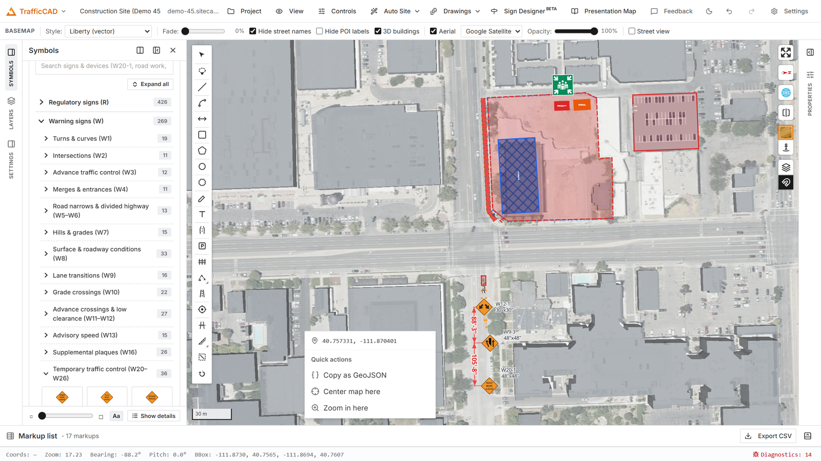
Right-click on empty map: Quick actions — copy the point as GeoJSON, center the map, or zoom in. Right-clicking a markup opens its own menu instead.
The status bar
The status bar along the bottom shows the live cursor coordinates, zoom, bearing, and pitch, and a button to expand the attribute table for a selected reference layer.
Theme
Use the sun/moon button on the toolbar to switch between light and dark themes. The theme also follows your operating system preference by default.
Desktop and browser
The same UI runs as an installed desktop app (built with Tauri) and as a web app in the browser. The browser build covers most workflows, but features that need the local filesystem (file dialogs, local MBTiles and raster reads) require the desktop app. Each affected page notes these differences. See Getting Started.